How to Scrapbook with Busy Print Paper
Hi There! It’s Lynda from Scrapbook with Lynda back to share another scrapbook page idea with you. Today I’ll share with you how to make your photographs pop when using busy background paper.

Getting there is part of the fun for a road trip, so I snapped a few photos along the way. This map paper by Paper House is ideal for my “ Adventure Traveling Together” layout, but it’s a busy print. Here’s how I made sure my photos weren’t lost on a busy background paper.
Add Layers of Solid or Tone on Tone Scrapbook Paper
My best tip is to add solid or tone on tone scrapbook paper to your scrapbook layout.

Busy print scrapbook paper can compete with your photos, but by adding a couple layers of solid or tone on tone print paper I brought focus to my photos.
How to Select Paper to Mat Your Photos
Look for colors that exist in the busy background print, so your layers will harmonize.

In my example, I selected a deeper shade of teal and yellow, than is in the map paper. Adding a darker frame about the photos in harmonizing colors also brings focus to my pictures.
The teal paper is a tone on tone paper, while the yellow one is a subtle, small print. The geometric print on the yellow paper adds structure and the small white print reads like a tone on tone.
Now the busy map print complements my photos and helps to tell the story, rather than overwhelm them.
Adding Embellishments to Busy Background Paper
Embellishments and their placement also helps to bring focus to your photos, plus they can help tell the story.
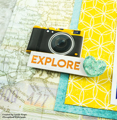
As you can see in the top photo above, I grouped the embellishments into clusters, rather than dotting them around the page. This too draws your eye away from the busy print paper and towards the pictures. And repeating colors in each cluster ties them together.
Scrapbook Page Title
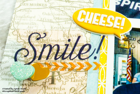
I created the title for this layout, by combining three different stickers.

These layered stickers by Paper House are so decorative that I didn’t need to add any other embellishments to create a great cluster. And look at all the dimension they add to my layout!
Zig Zag Your Embellishment and Cluster Placements
I positioned the embellishments clusters in a zig zag pattern on my layout, because that keeps the eye moving through the photos on the page.

Each cluster has both teal and gold, which complement the paper, but also include some colors in my photos.

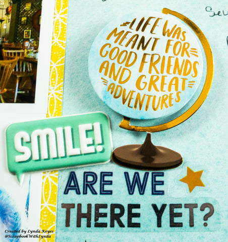
I love all the fun travel sayings in this sticker pack. Not only do they look great on my layout, but they help to tell the story.
You’ll notice that I varied the size of each cluster, but did include both gold and teal in each one. Varying the size adds variety to the layout, while consistent colors tie them all together.
Mix Up Your Sticker Embellishments
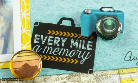
In addition to varying the size of my stickers, I also varied their type. Mixing puffy, flat, 3D, and enamel embellishments adds lots of interest to the page.

Last but not least, by adding tone-on-tone mats and keeping the clusters near my photos, this busy map paper enhances the story of this layout without overwhelming the photos. It’s the ideal background paper for any road trip and with so many colors in it you can select a wide variety of mat colors to coordinate with your photos.
Scrapbook Products Used
- Scrapbook Paper - United States Map P-2186E
- Scrapbook Paper - Teal Marble P-2172E
- Scrapbook Paper - Explore Your World Tags P-2164E
- 3D Scrapbook Stickers - Adventure At Heart STDM-0319E
- Clear Scrapbook Stickers - Travel STCL-8001E
Remember to use the code PH21LYNDA at checkout to save 20% off your order.
I hope this blog post helps you tame busy print scrapbook paper, so it accents your photos.
Please check out my blog, Pinterest, Instagram and Facebook pages to see other projects I’m creating.
Happy Scrapping!
Lynda


